Simple Wall Treatment

Mini Wood Cabin
 This wall design use second-hand materials. Brilliant ideas to create beautiful in low cost budget.
Read More......
Simple Wall Treatment
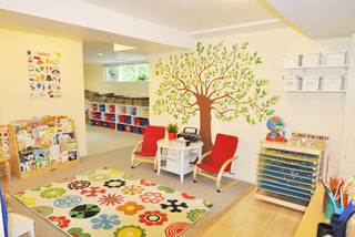
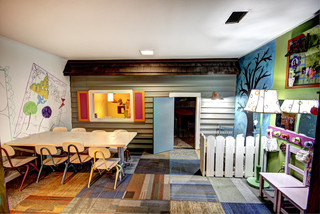
Designing Children Daycare
Let's talk about children and interior design.
Children, especially in early age need a place that provide safety, caring, love and education. School for early ages or children daycare should be designed according those requirements. Children daycare is a place full of tiny creatures gathered around learning how to play,socialize, cry, pee and sleep. okay, that's my humble opinion. I am not talking or writing about school design, I will post on next topic but now focus on how to design children daycare. Daycare is for children age 6 months to 5 years old. I think In some countries this age categorizing is a bit different. Because in that age, children are not able to take care of themselves, yet. They still need adult chaperones who provide guidance, teaching and caring.


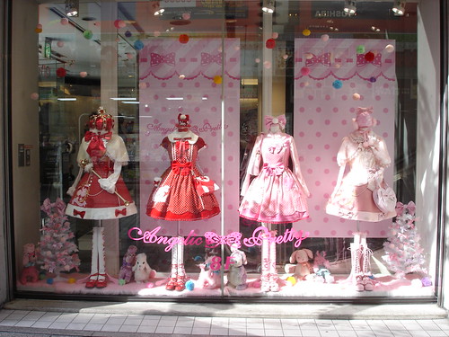


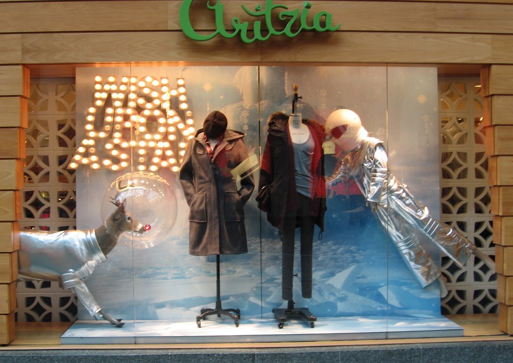


 Window display design is the first impression people to customer to see what you are selling on your store.


BusinessWeek/Architectural Record annual design award winners
Here are few of best building designs according to Business Week. Some of them are good in design and function.
The winners of this year's BusinessWeek/Architectural Record awards demonstrate a pragmatism that seems appropriate in these credit-crunched times. That's not to say the designs are boring. The new headquarters for workspace design firm Haworth (above, kitted out with all its own products for potential clients to see in action) are striking, while the huge steel lattices running from top to bottom of the south sides of the towers of Poly Real Estate's Poly International Plaza in Guangzhou, China act both as decoration and as energy-saving shade. All six winning projects are emblematic of the awards' semi-official slogan, "Good Design is Good Business."
One Haworth Center: From Dull to Dramatic
Location: Holland, Mich.
Client: Haworth
Architect: Perkins + Will
Office designer Haworth replaced its dull, traditional building with a structure that has a dramatic, swooping glass-walled atrium running along one side the building.


 Tokyo Swatch by Shigeru Ban
by Terri Peters
The new Swatch flagship store in Tokyo's Ginza district immediately stands out from the surrounding high-end fashion boutiques on this densely packed street. There is no doorway, no visible sign, and no glass storefront. Instead, a towering four-story void in the streetscape seems to signify a civic-scale entry.
The building's enormous retractable glass "shutters" create this dramatic effect when open. Then when the shutters are down — on rainy days and when the shop is closed — the building is disguised as a normal, curtain-wall office building.
This unusual store, named the Nicolas G. Hayek Center, is the work of U.S.-trained Japanese architect Shigeru Ban. Even at first glance, the building reveals itself as more than just a fancy facade: it is real architecture, a project about volume, spatial complexity, and experimentation.


Architectural Drapery, The Cascade Coil Drapery
Architectural Drapery mesh interweaves weatherproof copper and stainless steel wire. Los Angeles–based designers ARYA Group used the mesh for the Village School gymnasium facade in Pacific Palisades, California.
INTERIOR DESIGN ELEMENTS
To design an interior space there are few elements that must be considered carefully for designers in order to create good design and solve the problems in space planning.
SPACE
The most essential element in space planning. There are 3 types of space element, flat space, perceptual space and actual space. Flat space is where there is no illusion of depth, consists height and width as seen in 2 dimensional drawing. Perceptual space is where the space is illusion like photographs or perspective drawings. We can create the illusion of depth by using shadows, colors, lines, mirrors, and lights.
The designer should have a complete understanding of the dynamics of perceptual and actual space and the difference between them,even though it may seem pretty obvious.The former is an illusion; the latter is a fact. But actual space can also be manipulated to create illusions by using other design elements like light, color, texture, line and reflected surfaces.
FORMS
The importance of forms in architecture-interior is obvious. Everything we touch, see, or feel is manifestation of forms. Form is the antithesis of space, i.e., if form is consideredto be a positive mass, then space would be considered negative. Forms can be either straight,curved, or irregular
 We designed this office lounge interior for banking office dedicated for special customers. Actually it is a sample of old fashioned office lounge interior design for old fashioned bank office. All used colors (grey and brown) are matched with corporate colors. With dominantly grey colors would make this office interior looks dull. The design is still in form of simple and minimalist interior design only the line textures applied on walls.
These interior lighting fiuxtures will create beautiful shadow. With colorful lights emerge the colourful shadow. It will enhance the atmosphere of your interior design. These are from koziol, available in hanging and floor lamp.
STIXX
The expressive impact of this lamp is enhanced to perfection by light. The myriad reflecting surfaces make the elements shimmer and shine, creating beautiful effects.

FUSION
The fascinating texture of this lamp, produces a mesmerizing interplay of light and shadow, making the lamp a design objec t in its own right. It can be showcased solo or in a rainbow chorus , and the wide choice of colors provides rich potential for an array of atmospheres.
This fixture emanates a sensuous, warm glow, colourful pattern-shadow and adds atmosphere to any interior.


This interior design sketch is the receptionist counter in karaoke room. The concept is modern style. It is designed using frosted glass, mirror, cement textured and vinyl wall covering for the wall combined with wooden counter table and display case. For ceiling, play with circular form in gypsum board, continuous lightings and spot lights for certain part of the ceilings. All colors are natural colors, gray, brown and beige.

Bar corner, special designed for billiard café. The counter table is made of wood and metal material, as for wall, the textured wall combined with vinyl wall covering to create warm ambiance.
Read More......
 This bar counter is special designed for office lounge. It was created sharp and clean in simple forms to represent its corporate image.
The only eye catcher is the bright red entrance gate. The ceiling is designed in cloud forms in gypsum board.

 These sketches show the interior design of corridor café. Each corridor has a different design especially on the wall and ceiling treatment. The one has a wall shelf in oriental style and textured paint. The other has frosted glass combine with wooden partition and painted wall. For the ceiling they have different design form and lighting style.


The view of interior hotel, the suite room. It’s an old project for amusement park design.


 Here are few sketches of interior design of karaoke singing hall. They are small singing rooms for 2-4 persons in contemporary style design.


 />
/>